This technique is for non-animated gifs. In each of the tables above, a gif was used as the
You can also use the gif as a table background. As you can see, gifs with a black background color do not always make especially successful transparencies. So try to find gifs with white, light colored or transparent backgrounds. You can also combine a bgcolor with a transparency plus the gif background with a transparency for special effects. Just experiment and see what happens.
NOTE: Although this technique will work for many gifs, there are a few that will not fade. If you find one of these, then use the type of code that I used above for jpgs that won't fade.
If you use a GIF with a portion transparent over a table bgcolor transparency, the GIF transparency doesn't work, according to Net4TV.
| GIF PLUS TRANSPARENT GIF |
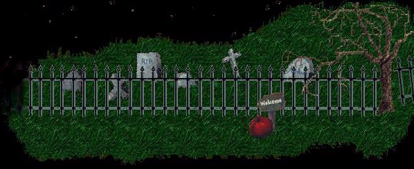
Below are two gifs as they appear separately: three ghosts and a skeleton, and a graveyard. Below them is the combined image of the graveyard used as the table background with the ghost gif set at 60% transparency. To make the transparency attribute work in this case, the ghost gif must be used in the <img src> tag. This will not work if the ghost gif is used as the <td> background.


 |
||
Ray (Scopehound) discovered this effect when using transparency. My example is immediately below. Look under "Examples of Transparency in Use" below for Ray's page. Here's his explanation. "You start out with a non-animated background image. Now you take an animated gif and make it the exact height and width of the background image. So you put the table together like this:"
 |
In the example above, the owl is a jpg; the "snow" is an animated gif. Putting the transparency attribute in with the animated gif makes the background image seem to blink. This is because animated gifs consist of images with alternating black and transparent or white backgrounds. The owl shows up only when the transparent background phase of the animated gif is onscreen.
Although this page concerns itself with how the transparency attribute behaves in a tabled form, it is possible to transparentize text, too. You use the tag and just add in the percent of transparency you desire. In the example below, the T and Y have no transparency; the others shade from 10% to 50% and back again in 10% increments:
| T R A N S P A R E N C Y |
However, I did play around with mixing transparent colors. So for this example, go to Mixing Colors Using Transparency.
EXAMPLES OF TRANSPARENCY IN USE
On this "Submarine" page, Flo has used four transparent layers of blue with the gifs sandwiched in between them to give the illusion of distance underwater. She had to stick to non-amimated gifs for this page, because animated gifs appeared to pop right to the surface layer, no matter which layer she tried to use them on. This page uses CSS to position and layer the various elements.
Tom Landrum (jawjahboy) has used a series of increasing transparency percentages for the introductory page for his Halloween slide show.
Ray (Scopehound) has used a transparency on this page. See his explanation above under "Blinking Effect with Images" above.
Glenda has used transparency to great effect in her Emerald page. "I took the background jpg....reduced it down to 20% of it's original size...so you get the effect that the stone is making it "appear" smaller....It is CSS'ed under the stone. Also...I CSS'ed div aligned the scopes and then the "bed" of the stone...then the scopes...and I used the transparency attribute to the "bed" of the stone..."
Fred's Textured Grad Backgrounds tutorial shows you how to use transparency to obtain textured background effects.